|
|
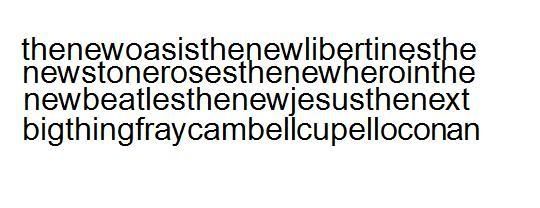
Post by cal on Mar 30, 2008 21:45:16 GMT
 thats my attempt |
|
|
|
Post by Andy on Mar 31, 2008 12:52:02 GMT
/\ I like it cal does give me a headache like when i try to read it but its nice  |
|
|
|
Post by kokainekinney on Mar 31, 2008 22:06:10 GMT
should have the band and S&C on the front, with member name and number (the number order in which you joined this forum) which was in the badge set. eg.
KOKAINEKINNEY
#13
get the shirt in black aswell.
just to add a few more ideas to the table!
|
|
|
|
Post by Fergal on Apr 3, 2008 20:14:30 GMT
aye i like that idea dec, keeping it simple, maybe an image of the band as well. lets cut to the chase though...cost?
|
|
|
|
Post by Darren on Apr 5, 2008 15:06:09 GMT
Loving your ideas, I'll knock up my design soon.
I'll gather some prices together, if I get a load made up somewhere I'm sure it'll be cheaper for everyone but you never know until you look 
|
|
|
|
Post by Darren on Apr 18, 2008 14:47:40 GMT
I have been having a look around for the cost of the t-shirt and many places are far too expensive for our needs. One place had some different designs to the normal ones bands use but were like £8 for the tee and print on front and back.
A cheaper alternative would be to have a standard tee like fruit of the loom without screenprint.
It all depends on how many people would want one too because it would be cheaper to go the screenprint way if over 200 were wanted.
I'll give this more research but in the meanwhile I like to know what the quality of material you would want? and how much you'd be prepared to pay?

|
|
|
|
Post by cal on Apr 18, 2008 15:06:53 GMT
bout a tenner id say, made out of a tshirt that aint gonna fall apart and with screen print
probably pay a bit more if need be
|
|
|
|
Post by Darren on Apr 18, 2008 15:20:20 GMT
bout a tenner id say, made out of a tshirt that aint gonna fall apart and with screen print probably pay a bit more if need be  I'd have thought p&p would bump it up to over a tenner I'd have thought p&p would bump it up to over a tenner 
I will post my own designs based on your ideas this weekend... |
|
|
|
Post by suspectdevice on Apr 18, 2008 16:04:23 GMT
 thats my attempt I like this one! Bit different to the norm |
|
|
|
Post by Darren on Apr 18, 2008 18:21:56 GMT
Yeah I like Cal's design too, I'll transfer your designs to the template I'm using and post it soon mate 
Come on! Let's see your creations too...
Here's one I quickly put together from your suggestions and designs in black or white, remember this is my first attempt and want as much feedback from you on how you'd change or add to it, thank you.
 
|
|
|
|
Post by Darren on Apr 18, 2008 19:05:47 GMT
Here's Cal's, with an added touch, what do you think?  |
|
|
|
Post by Andy on Apr 18, 2008 20:53:41 GMT
I really like the cals designed one the best
but the 2 that you have done darren are mint as well - if I had the choice - i'd def buy both
did we scratch the idea of having the user name on the back? - if not then put them underneath the S&C002
but overall the font on darrens are really nice
but as I said - I really like cals design - perhaps with a different font?
and i'd pay a tenner w/ p&p
|
|
|
|
Post by cal on Apr 19, 2008 0:21:14 GMT
woop woop im loving mine haha
i think the one darren did is mega, but the picture i think needs to be more centralised not at the bottom.
to be honest ill pay whatever as long as it aint silly prices
|
|
|
|
Post by Darren on Apr 19, 2008 6:10:28 GMT
I had a look into this when finding out printing prices and it would be well over £15 if you start adding personalized extras.
I was thinking of having a seperate custom badge or even a patch displaying your UN, then you can pin/sew it to your tee  I thought that it should be on the back but after showing my designs to friends they thought the image at the bottom on the front was the way to go for something a little different, pretty much like the madchester era t-shirts they reckon I thought that it should be on the back but after showing my designs to friends they thought the image at the bottom on the front was the way to go for something a little different, pretty much like the madchester era t-shirts they reckon  but if you lot don't like it there then it'll be moved. but if you lot don't like it there then it'll be moved.
Keep your suggestions/thoughts/comments coming... the final design(s) need to be finalized before I get a proper quote 
|
|
|
|
Post by Andy on Apr 19, 2008 8:58:53 GMT
I thought it does look a tad weird with the pic at the bottom as well - as cal said - it might look better in the middle. but the S&C logo looks really nice on it other then that - both initial designs look really mint one small thing as well - isn't campbell spelt with a P?  - just before you obviously start printing the tees  |
|