|
|
Post by cb on Nov 10, 2009 18:29:01 GMT
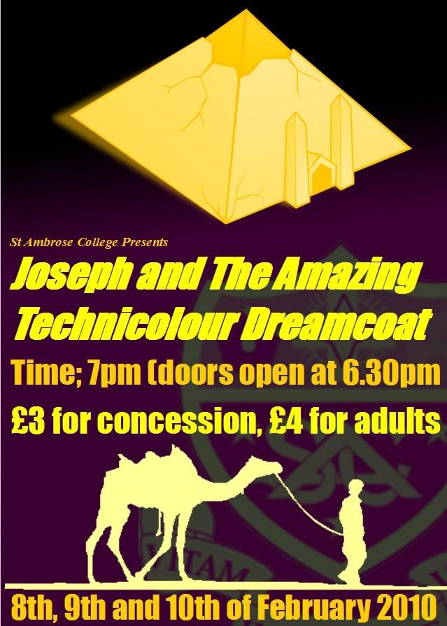
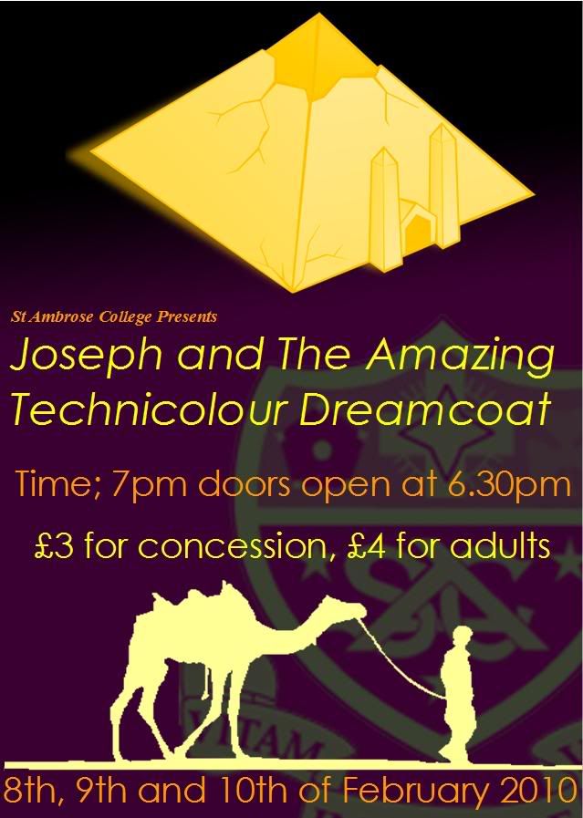
For a a design tech project, i had to design a Joseph and the Amazing Technicolour Dreamcoat poster ticket and programme for the school production. so far ive done the poster. any comments or critism is appriciated. thanks  |
|
|
|
Post by Sean on Nov 10, 2009 19:03:02 GMT
nice color scheme going on but maybe a more classy font if you get me, something like century gothic. and try without the bold, works sometimes  |
|
|
|
Post by cb on Nov 10, 2009 19:12:08 GMT
cheers mate, did what you said but it think it stands out more with impact  |
|
|
|
Post by cb on Nov 10, 2009 21:19:29 GMT
hmm dunno what else to do
|
|
|
|
Post by Sean on Nov 11, 2009 6:16:42 GMT
me neither its pretty good
|
|
|
|
Post by chezza on Nov 18, 2009 21:51:55 GMT
Nice! You got more digital talent then my Year 10s...can't even get them to convert documents to PDFs...
Joseph - my favourite musical could sing it from start to finish when I was 11 - I wore the record out I played it that many times!!!
|
|
|
|
Post by cb on Nov 19, 2009 17:31:14 GMT
haha thanks chezza! i hate it. so boring! haha
|
|